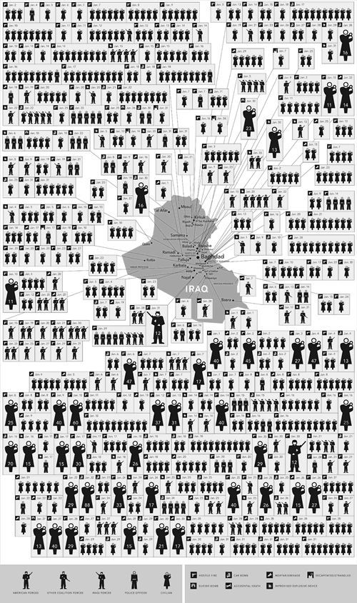
You can look at it as either an indictment of the current strategy (or lack thereof) in Iraq or a testament to the power of presenting information in an easily-graspable way, but the chart below, showing the war-related deaths in Iraq for last month only is hard to ignore:

Click to see the image at full size.
This graphic accompanies this New York Times piece.