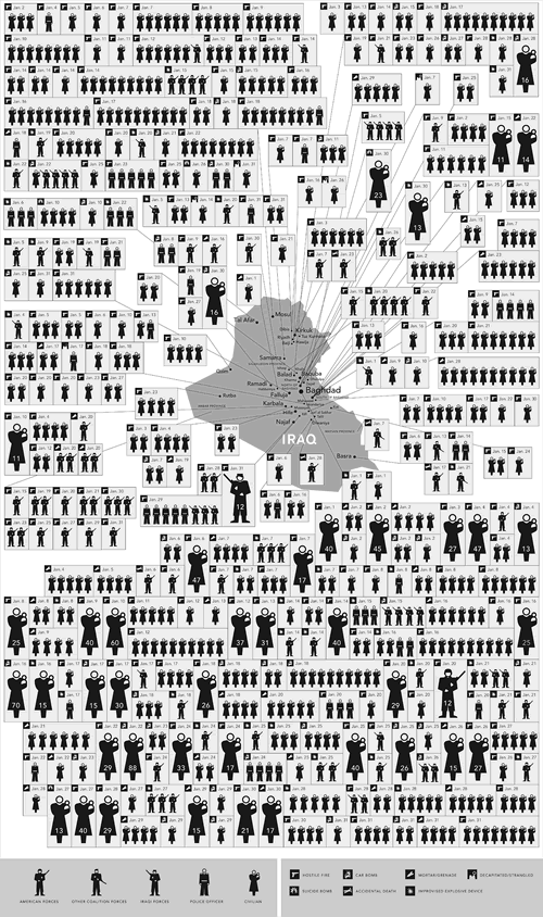
Chart: 31 Days in Iraq
You can look at it as either an indictment of the current strategy (or lack thereof) in Iraq or a testament to the power of presenting information in an easily-graspable way, but the chart below, showing the war-related deaths in Iraq for last month only is hard to ignore:

Click to see the image at full size.
This graphic accompanies this New York Times piece.
Recent Posts
A reminder for April Fools’ Day
Have a good April Fools’ Day tomorrow, but be mindful about your pranking.
How NOT to sell a computer
As I’ve written before, I sometimes browse Facebook Marketplace for nothing more than pure entertainment,…
Happy 10th anniversary, Anitra!
Ten years ago today, this happened: And since that day, it’s been an adventure. Thank…
Last Sunday’s accordion gig in Bonita Springs
It’s been over a year since I’ve played with Tom Hood’s band, the Tropical Sons.…
My plans for Burns Night 2025
Here’s the main course for dinner tonight... ...and that’s because it’s January 25th today, making…