Visual Thinking Day, Part 1: Where the best IHOP-to-Pancake Lover Ratios Are
If you’ve ever wondered which states have the best access to the International House of Pancakes (and they truly are international — they’ve got ’em in Japan, too!), wonder no more. The blog Very Small Array has the answer, and in a lovely visual form to boot:
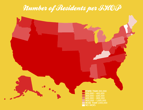
Click the map to see it at full size on its original page.

For those of you who live in the South (dudes at the Starkville Tucows office, I’m lookin’ at you!), there’s another chart showing which states have the best access to Waffle House.


Recent Posts
A reminder for April Fools’ Day
Have a good April Fools’ Day tomorrow, but be mindful about your pranking.
How NOT to sell a computer
As I’ve written before, I sometimes browse Facebook Marketplace for nothing more than pure entertainment,…
Happy 10th anniversary, Anitra!
Ten years ago today, this happened: And since that day, it’s been an adventure. Thank…
Last Sunday’s accordion gig in Bonita Springs
It’s been over a year since I’ve played with Tom Hood’s band, the Tropical Sons.…
My plans for Burns Night 2025
Here’s the main course for dinner tonight... ...and that’s because it’s January 25th today, making…