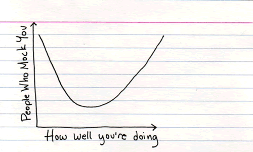
One blog you should check out is Indexed, Jessica Hagy’s blog that’s completely based on charts, graphs, Venn diagrams and other visualizations. I posted a chart from Indexed titled The Seven Deadly Sins earlier this year. Here are some more…
Here’s one on dating and age…

Click the chart to see it on its original page.
Here’s one that answers the question “What did you do last weekend?”, based on your particular subculture…

Click the chart to see it on its original page.
And here’s one from that explains one of the little-publicized advantages of being average (although you can have “average” — I’m aiming for the right end of the curve, myself…)
