30 Minutes with CNN Headline News
Here’s a pie chart showing the content of half an hour’s worth of CNN Headline News. No wonder the results from that Indiana University study said that The Daily Show was as substantive as “real” news shows…
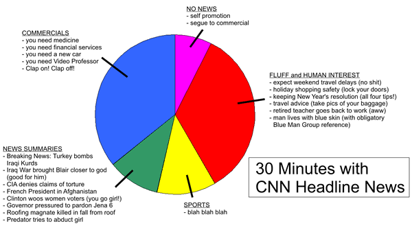
Click the graph to see it on full size on its original page.


Recent Posts
Sunday picdump for December 22, 2024
It’s not just another Sunday, but the Sunday leading up to Christmas! It’s that time…
A reminder for April Fools’ Day
Have a good April Fools’ Day tomorrow, but be mindful about your pranking.
How NOT to sell a computer
As I’ve written before, I sometimes browse Facebook Marketplace for nothing more than pure entertainment,…
Sunday picdump for March 23, 2025
Another Sunday, another “picdump!” Here are 250 memes, pictures, and cartoons floating around the internet…
Sunday picdump for March 16, 2025
Another Sunday, another “picdump!” Here are 200+ memes, pictures, and cartoons floating around the internet…
Sunday picdump for March 9, 2025
Another Sunday, another “picdump!” Here are 200+ memes, pictures, and cartoons floating around the internet…
View Comments
Thank you for making me feel a whole lot better about getting rid of cable/satellite TV. (Well, I guess I am missing The Daily Show, too, in addition to the hard-hitting journalism of Headline News).