Categories
Uncategorized

Interview: Jane Motz Hayes on SEO and Usability

[This article was also posted on Global Nerdy.]

Search Engine Strategies 2008 Toronto

Search Engine Strategies 2008 Toronto logo

I have a tit-for-tat arrangement with the folks behind the upcoming Search Engine Strategies 2008 Toronto conference (which runs from June 16th through 18th): they’ll give me a media pass for the conference in exchange for my blogging (both on this blog and on Global Nerdy) from the conference as well as interviewing some of the conference presenters. I’ve been meaning to learn more about search engine optimization and getting one-on-one time with a presenter is pretty difficult, so I think I’m getting the better part of the bargain.

Jane Motz Hayes

Jane Motz HayesMy first interview is with Jane Motz Hayes, who is an Information Designer at WebFeat, a multimedia company that provides services for online marketing, employee learning and hosting/data management/content management services. She’ll be on a panel called Accessibility, Usability & SEO. Here’s the abstract for the session:

Which user experience elements have you been neglecting? Is your site working, accessible, intuitive, and persuasive? Is it compliant with government accessibility regulations? Do you have a regimen for user testing? Building a user-friendly and accessible site generally coincides with SEO strategy, but not always. If you make changes to the site, will there be positive or negative repercussions on search engine traffic?

The panel takes place on day 2 of the conference, Wednesday, June 18th at 2:30 p.m.. If you’d like to catch this panel as well as the rest of the conference, go here and register for Search Engine Strategies 2008 Toronto.

I had the chance to have an email conversation with Jane recently. Since her panel discussion is going to be about accessibility, usability and SEO, I thought that would be a good jumping-off point for the interview. I asked her some questions, and she sent back some answers, and they appear below. Enjoy!

The Connection Between SEO and Usability

Being findable by search engines and being easy to use by human beings seem like two very things — one’s about machines and the other’s about people. So what’s the connection between SEO and usability?

SEO-Usability handshakeSEO and Usability are both about humans. You can’t have one without the other. Humans use search engines to seek and find information according to the nature of their query — encapsulated as a keyword search. To say that SEO is only about machines omits the human factor, which is kind of the point.

At WebFeat, we think about how to optimize a website for search during the definition and planning phase and we treat search crawlers like an audience (or persona) whose information needs can be satisfied in the pages of the website. By treating search crawlers as an end user, we design all of the pages to be findable on search engine results pages. In the real world it doesn’t make sense to build a store and then not advertise its location or put up a sign informing customers what the shop is, why its useful to them, or whether to push or pull the door to come in. The same applies to the online space. If you aren’t ranking on the first search engine results page for your brand / name, then you’re less usable to humans. Usability is inherent to SEO.

Getting SEO People and Usability People on the Same Page

Usability is usually the domain of conscientious designers and developers, and if you’re lucky, your company’s usability consultant or specialist. Meanwhile, SEO is usually managed by sales, marketing and the occasional developer with “suit” tendencies. With such different groups with different agendas, how do people get both SEO and usability to align?

Usability is indeed an SEO issue, and vice versa. At WebFeat, we align the two by interconnecting user experience goals at the onset — and ensuring that every stakeholder understands and agrees that there is improved performance to be gained. When the common ground is increasing sales and improving customer relationships, the case for Usability and SEO alignment is made simple. Findability is a priority for website use – and the natural fit is a user-friendly interface and useful content that is accessible, findable and visible to search engines.

It was Dan Saffer who wrote that user experience is everyone’s responsibility, and web teams all have a stake in ensuring usable, findable websites. In the end, it comes down to better performance as the common agenda and focus.

The Three-Way Tug-of-War Between Usability, SEO and Beauty

Three-way tug-of-war between two dogs and a person

There’s often a tension between designs that are “cool” and designs that are usable, as well as a tension between optimizing for SEO and making a beautiful site. Surely when dealing with a three-way tug-of-war between usability, SEO and beauty, not everyone wins. How do you deal with these differing agendas?

We see this tension all the time, and more often than not, it is the person sitting in my seat on the team, that must mediate the tug-of-war and broker a peaceful solution. But managing opinions and outcomes becomes easier when you advocate hard for the end user — taking this position tends to neutralize territorial agendas and lessen the risk of offending anyone. Indeed there are studies that show that users deem aesthetically pleasing websites as more credible than those with poor information design, and other studies show the ROI of usability. There are even more studies that show the attempts to measure the ROI of SEO. One can appeal to research to provide guidance, but in the end, looking at the users’ requirements of the website, the client goals, and of course the budget and timeline, will help drive out the design, and how much user research and how many SEO tactics you can tackle.

What About Personas?
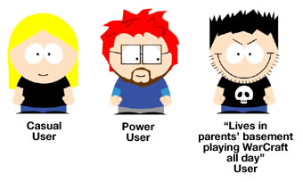
Personas

I’ve been to a couple of get-togethers where UI types go out for drinks (yes, there seem to be a lot of them) and one thing I always hear them talking about is “personas” — fictious example users that participate in different scenarios that help guide their designs (such as “Bobby is not really a technical person and uses the site rarely…” and “Carol is a power user who uses the service several times a day…”). If usability and SEO are related, perhaps there’s a persona for a search engine. What would that persona be like?

This is a good question. Personas are often criticized for making broad assumptions and for being tied too closely to real customer data. But I think, as a user research tool, they can be very powerful when implemented properly. That being said – what’s the persona of a search engine? A search engine – let’s call her Jane Doe – is a task-oriented girl who browses the web looking for things she deems important (her mind is always changing and she’s not oft to disclose why she’s changed it) and she likes to keep a record of everything. Once her browsing is complete, Jane stores all of her findings neatly in her apartment as she waits to be asked for something in particular. If you ask her nicely (using the “right” keywords), Jane will think about it for a minute and then provide you with exactly what you need in the order of her choosing. If you don’t ask properly, Jane will give you nothing of use at all. Such is the same with search engines. They crawl the web, indexing documents, then processing queries (based on keyword searches) and provide results based on the algorithm of the search engine. Search engine results pages are prioritized according to the algorithmic determinants of the individual engine. It is part of their charm — they can be great and they can suck. It all depends on who they’re talking to.

Using SEO to “Sell” Usability?

In many projects I’ve worked on, usability got short shift, being an afterthought if it was even considered at all. I can see SEO being an easier “sell” to management, as it’s easier to make the connection between it and readers, conversions and money. What do you think of using SEO as a “trojan horse” to sneak some usability work into projects?

Search Engine Optimization is often easier to sell because clients can “see it” and also make a direct connection to ROI — user-centered design is more difficult to conceptualize and quantify a value. But I feel like the tide is turning, as more and more clients understand the value of Usability in informing their website strategy. More than ever, clients understand that usable websites are a measure of brand reputation and credibility – especially those selling products or services online.

That being said, price-sensitive clients may not have the budget for both User Research and SEO so defining KPIs and keyword research is important. KPIs help drive the user experience and well-researched keywords can create a basis for off-page SEO tactics like copy writing and information architecture — which all contribute to a positive user experience. One way to insure proper search visibility is to build off-page SEO best practices into your development process so that you don’t end up with something that can’t be crawled or indexed in natural search When budget becomes available, essential on-page tactics like copy optimization and link-building can occur.

Categories
Uncategorized

The Pee-Wee Herman Picture Show

The bike

The bike! Click the photo to see it on its Flickr page.

Last night, the Ginger Ninja and I caught the 9:30 presentation of The Pee-Wee Herman Picture Show, a showing of the cult classic Pee-Wee’s Big Adventure, dramatically augmented by a simultaneous live performance of the movie by local community activists and indie rock stars from the Hidden Cameras, Apostle of Hustle, Broken Social Scene, Kids on TV, Republic of Safety and The Phonemes.

Why did such a production take place? Aside from the fact that it’s a fun and new way to see an old film, it’s also a great way to kick off Bike Month, when we here in Accordion City promote the bicycle as a fuel- and cost-efficient, fitness-building, environment- and community-friendly way of getting around. It’s also a better way to convince people to bike than having some patchouli-reeking unwashed hemp-clad underemployed hippie chaining himself to an SUV and reading bad poetry and manifestos about bicycles, which is what a lot of bike awareness rallies feel like.

Lex Vaughan as Pee-Wee Herman
Lex Vaughan made an excellent Pee-Wee.
Photo from Eye Weekly.

Local artist Lex Vaughan (of the art duo “Bucky and Fluff”) played the titular role, with Dave Meslin acting as a Pee-Wee stunt and mirror double. Both Vaughan and Meslin used thier playing the same person to great effect, especially in the scenes where Pee-Wee made a quick change of outfit and where Pee-Wee primps in front of a mirror. The other actors played several roles — not just as people in the movie, but also as props and scenery. One of the best bits was when a dozen people played the role of Pee-Wee’s breakfast-making machine.

I took photos throughout the performance, and you can see them in my Flickr photoset, titled The Pee-Wee Herman Picture Show. I’ve got some samples below — click them to see them on their Flickr pages:

Francis tries to buy the bike
Francis tries to buy the bike.
Click the photo to see it on its Flickr page.

"But that means the Large Marge I was riding with was...A GHOST!"
“But that means the Large Marge I was riding with was…A GHOST!”
Click the photo to see it on its Flickr page.

The Tequila Dance, Part 1
“Tequila!”
Click the photo to see it on its Flickr page.

Crashing the Twisted Sister video shoot
Crashing the Twisted Sister video shoot.
Click the photo to see it on its Flickr page.

For more about The Pee-Wee Herman Picture Show and the people behind it, check out this article from local weekly paper Eye Weekly: Toronto Cyclists’ Big Adventure.

Categories
Uncategorized

Promo for “Guitar Hero” Nintendo DS: Really Bad or Ironically Bad? I Can’t Tell.

I’d normally post this on Global Nerdy (and I did), but I figured that the appeal of the Guitar Hero series of games was broad enough to merit my posting this here.

Take a look at this promo ad that walks you through the gameplay of Guitar Hero: On Tour, the version for the Nintendo DS handheld game system.

My question is: is it…

  • An intentionally bad promo that parodies 1980s ads for game systems like the Atari 2600, Intellivision and Colecovision?
  • An unintentionally bad ad created by a game company that bought the rights to the Guitar Hero name (the original Guitar Hero team now works on Rock Band) and whose best days are behind it?

I like the attachable fret buttons-and-pick idea; I’m less sure about yelling “Rock out!” into the microphone to activate Star Power, and not at all thrilled about the silly “put out the fire on your guitar by blowing into the microphone” concept.

What do you think?

Categories
Uncategorized

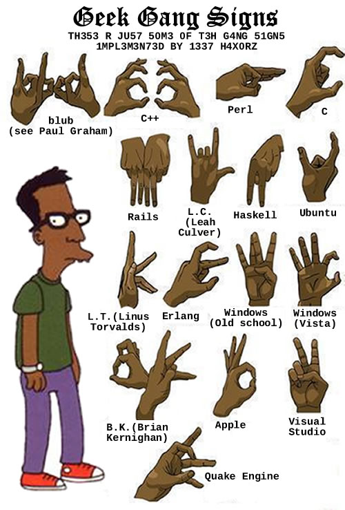
Geek Gang Signs

Looking at a “Gang Signs” chart, I asked myself “Why should gangstas have all the fun?” The end result: the “Geek Signs” chart, pictured below. Enjoy!

Geek Gang Signs
Click the image to see the original version.

[This was also posted on Global Nerdy.]

Categories
Uncategorized

Feedback: Different Meanings of Single, My Car Ownership Status, Inadvertently Promoting McCain and IonCleanse

There’s Single, and Then There’s Single

Cover of the soundtrack for the movie \"Singles\"
Can you believe it’s been 16 years since this movie? Weird.

In the article Further Thoughts on “Toronto the Naughty”, I described local nightlife activist and Newmindspace co-founder Kevin Bracken as “single”. My buddy Pete Forde said “no, he’s not single; he’s in a relationship,” to which “yes, he’s single; he’s not married.”

It’s interesting how bits of your language change as you move from one phase of life to another; I recall using the term “single” in the same sense that Pete used it. I’m reminded of an observation in Clay Shirky’s book, Here Comes Everybody: The Power of Organizing Without Organizations: Only people who have already met their spouse say that cites are dead.

My Car Ownership Status

Red 1998 Honda CR-V
A 1998 Honda CR-V.

In the article Gas Pains, I mentioned that I typically spend the equivalent of US$75 on gas every 6 to 8 weeks. At least four people wrote in via email to say something along the lines of “You have a car?

This isn’t the first time that someone’s been surprised at my car ownership status. A former co-worker of mine at Tucows who used to butt heads with me regularly over developer relations once expressed surprise at my owning a car by saying “You have a car? But…but you’re an anarchist!

(“Bon vivant”, sure. On certain days, you might be right to go with “libertine”. But “anarchist?” Hardly.)

I drive a 1998 Honda CR-V that barely has any scratches or mileage. The car’s 10 years old and has less than 100,000 kilometres (around 60,000 miles) on the odometer. It’s not used for commuting to work, occasionally used for going out on the town and on weekends for shopping trips and over to my sister’s house for our weekly family dinner. It’s good for the environment, but more importantly, it’s good for my health (as I bike to work as well as for small grocery runs) and for my wallet.

But yes, I do have a car.

Those Context-Driven Ads

I run Google’s AdSense ads on both this blog and Global Nerdy. AdSense uses Google’s search engine tech to scan this blog and present ads related to the text of my articles. The idea is that people are more likely to click on ads that a related to whatever they’re reading. The rules don’t allow me to disclose what I make in a very specific way, but I am allowed to say that it covers my wardrobe budget or allows me to take the Ginger Ninja out to a very nice restaurant reasonably often.

There are some downsides. Being software, it has no idea of contextual subtlety and will display ads that send a message or opinion opposite to my own. The Gas Pains article mentions George W. Bush in a number of places, and since John McCain is strongly connected to George Bush as far as Google’s search engine is concerned, guess what ads appeared:

Screen capture of \"Gas Pains\" article with John McCain ads
Screenshot courtesy of Charles Starrett.

Ah, the vagaries of computer-based recommendations. I’ll have to set aside some time to go into my AdSense settings block Republican ads (despite my being based in Canada, about 60% of my readers are from the U.S., so I’d rather show ads for my preferred candidate, Obama, who seems to be the choice of a number of prominent techies). I may not be eligible to vote, but I am eligible to influence.

Thanks to Charles Starrett for pointing that one out!

IonCleanse’s True Believers

Section of the IonCleanse poster showing “before” and “after” photos.
An IonCleanse poster hanging in the storefront of a chiropractic office near my home in High Park.

I’ve received a number of responses, via email, comments and in person, to my IonCleanse article. A number of people believe it’s real. I still think it smacks of quackery. I should check up with Pete and see if he’s raised enough money to take the IonCleanse challenge.

Categories
In the News Uncategorized

Happy 51st Birthday, Siouxsie Sioux!

Siouxsie Sioux
Siouxsie Sioux.

Yet another sign I’m getting old: an alt-rock icon from my teen years turned 51 today — Susan Janet Ballion, better known to the world as Siouxsie Sioux (pronounced “Suzie Sue”). She and her band, Siouxsie the Banshees, were a mainstay of my music collection, and if you were a regular at Clark Hall Pub (the engineering pub at Crazy Go Nuts University) during my 1989 – 1994 DJ run, you’d probably hear one of the singles during my alt-rock sets. Somewhere in my parents’ basement is a near-complete collection of Siouxsie and the Banshees vinyl LPs; I’ll have to dig them up sometime.

In her honour, here are some Siouxsie and the Banshees videos for your enjoyment. Happy birthday, Siouxsie!

Here’s Hong Kong Garden by Siouxie and the Banshees, from 1978:

And now, some Siouxsie and the Banshees numbers from my teen years, the eighties. I’ll start with Christine from 1980:

Here’s Cities in Dust, from 1985:

Here’s their 1983 cover of Dear Prudence, which made it to a number of my mix tapes:

I’d be remiss if I didn’t show you the video for the one Siouxsie and the Banshees number that featured an accordion (or at least a very well-synthesized accordion): Peek-a-Boo, from 1988…

And finally, here’s Kiss Them for Me, from 1991, the Lollapalooza era:

Categories
It Happened to Me

My First Brush with the Music Industry

This article also appears in Global Nerdy.

Clay Shirky: Gin, Television, and Social Surplus

Gin and television

If you’re a reader of the usual sites with links that nerds like, you’ve probably seen the video or read the writeup of Clay Shirky’s presentation at Web 2.0 on “Gin, Television, and Social Surplus”.

In his presentation, he describes a conversation with a TV producer, in which he talked about the effort that people put into the “Pluto” entry in Wikipedia. The producer, hearing this story, rolled her eyes and asked “Where do they find the time?”

Clay suggests that the producer believed that “free time”, which he refers to as “cognitive surplus” or “social surplus”, was TV’s by divine right. He posits that the mental energy once devoted to television watching and other equally passive ways of filling one’s spare time is being better spent — on the internet.

(I’ve always found that saying someone has “too much time on their hands” is an intellectually dishonest way of dismissing someone: see my entry Too Much Spare Time? and Cory Doctorow’s essay, Too Much Time on His Hands.)

If you haven’t seen the video of Clay’s presentation, here it is — it’s 16 minutes of your free time well spent:

The TV producer reminded me of a record executive whom I encountered at my first job out of school. It’s an interesting story about programming work and technology in the mid-90’s, the music industry and how predictions about technology can be way, way off.

My First Job Out of School

Main screen of the 1991 \"Mackerel Stack\"
A screenshot from the 1991 version of the Mackerel Stack, a HyperCard stack the promoted Mackerel’s design work.

My first job fresh from getting my computer science degree at Crazy Go Nuts University was developing multimedia applications in Director at a little company called Mackerel Interactive Multimedia.

The year was 1995, when Myst still defined the cutting edge of multimedia, CD-ROMs and sound cards were still fairly novel peripherals and the only other opportunities for a wet-behind-the ears developer seemed to be at a bank or insurance company, neither of which seemed to be appealing. While the pay wasn’t great — I used to call us the “hos of technology” and did a Full Metal Jacket-esque routine that ended with me shouting “Me so geeky! Clicky-clicky! Me hack for long time!” — the place wasn’t soul-killing like a bank or insurance company might have been. I could wear whatever I wanted, I could dress up my office space however I pleased, the hours were flexible and the co-workers were great: a hip and cool set of young people, with a near 50:50 gender balance. It seemed like Douglas Coupland’s Microserfs, which had just been published at that time, right down to the ill-advised office romances (one of which was mine).

While the dream at the company was to write the next Myst, we paid the bills by writing multimedia apps for clients — typically interactive advertising or educational pieces that would eventually be distributed on CDs or even multiple floppies.

The company went under after a disastrous merger in 1997. Its story was covered by Cory Doctorow wrote an article for Wired about the Mackerel’s demise; unfortunately, it never got published in the magazine. The Mackerel story is told from a different angle by co-founders Dave Groff and Kevin Steele at the Smackerel site, which is subtitled A Biased History of Interactive Media.

Enter the Record Exec

All-female band
One of the bands represented by the record exec’s company. You can try to guess who they are, and you should be able to figure out the record company as well.

One day during the summer of 1996, one of the founders came into the area where the developers hung out and told us that we’d landed a contract with an independent record label belonging to a major record company.

“Isn’t that a contradiction in terms?” I asked.

Apparently it wasn’t. The indy label turned out to be merely a new branch of the major record company. It would sign up-and-coming underground and alternative acts and use the major label for distribution. If the major label was pin-striped and buttoned-down, the indy label was its edgier nephew, clad in faux Hot Topic-esque cred. In spite of their trying-too-hard-to-be-cool aspects, we thought they’d make an interesting client.

The record company exec was a woman who was about five years past their twenty-something demographic. She gave off more of a business school vibe than a rock vibe. She peppered her speech with business-school-isms like “target audience” and “units sold”. She used the word “product” several times and didn’t use the word “music” or even “album” once. Everything she knew about music didn’t come from being a fan; it came from what she’d read in her market research reports.

“That’s why they don’t call it show art,” one of us quipped.

The Brainstorming Session

CD player app from Apple System 7
The CD player application from System 7, the version of Mac OS from 1996.

One of the goals of this initial meeting was to brainstorm some ideas for interactive apps that we could build for them. I had been working on an idea that I was rather proud of: CD player apps customized for specific albums. For any CD other than the one for it was customized, it would show a mostly plain interface, plus some promos for the album. However, if you used the player to play the album for which it was customized, it would “come alive” with lyrics, liner notes, album art and so on. It was an attempt to bring back what was lost in the move from LPs to CDs.

“Nice try, kid,” said the exec with great disdain. “We did some market research and we’ve determined that no one will ever listen to music on their computer. People see them as machines for getting work done. We’re aiming for the rec room, the den, the living room and the bedroom, not the home office. You computer guys are aiming for home office.”

“You sure about that?” our production manager asked. “We all use the CD players on our machines. For some of us, our computers are in our bedrooms and living rooms, and they’re also our primary stereos now.”

“That may be true for you,” she replied, “but you guys are the exception. Computers are great, but they’re office equipment. You don’t keep a typewriter or photocopier in your living room, so why would you have a computer there? And that’s where people listen to their music. Office equipment and entertainment: apples and oranges. Trust me – I’ve been in the music industry for a while – no one’s going to listen to music on their computer.

I listened as a few other people had their ideas shot down in similar fashion. It was a matter of her knowing the music industry better than we did.

The Hail Mary MP3 Play

At some point during the increasingly futile brainstorming session, I remembered something that I’d brought back from the Macromedia User Conference. I reached into my laptop bag and fished out a floppy disc.

Set of three 3.5\" floppy disks

“Here, check this out,” I said, slotting the diskette into my laptop. “It’s something called Shockwave, which lets you embed multimedia applications inside web pages.”

We don’t think there will be much interest in the world wide web outside of technical people. The pictures are tiny, you’re stuck with default fonts, and your customers have to go buy a modem. Too much tech hassle, too little payoff.”

“You should give this a look,” I insisted. “The company that makes the tool we use to write multimedia software is using MPEG layer 3 [the term “MP3″ hadn’t made common parlance yet] compression to squeeze music files into less space. There’s a small multimedia program on this floppy, and a whole three-minute song. It would normally take about 8 floppies to hold this song.”

I put the disk in my laptop and launched the Shockwave application, which started a tune playing.

“Sounds like crap,” she said. “And who’s the band? The Spin Doctors? They’re so over.”

“Ignore the band,” I said, trying to remain patient. “Just think of the possibilities. This three-minute single is only a megabyte in size. It fits on a floppy, which you can hand out, or you’d be able to download it in a reasonable amount of time. The download will be even faster on the new 56K modems.”

“Blah, blah, blah,” she said, making that opening-and-closing hand gesture signifying pointless chatter. “It only means something to you because you’re a techie. I’ve seen the market research, and I will tell you now: people are not going to be getting their entertainment from computers or the internet. It’s going to come from set-top boxes and MiniDisc recharging stations at their record stores.

At this point, I decided that discretion was the better part of valour. “Well, you seem to have all the market research, so maybe the best thing would be for you to come up with ideas for an interactive application, and then we can hammer out the details with you in a later meeting.”

“I think that would be a good idea,” she said. She rose from her seat to leave the room, shaking her head.

“I don’t know about you,” I said to the others after confirming that she was out of earshot, “but I think the music industry needs to be destroyed.”