You young’uns may have learned about typefaces and the difference between serif and sans serif from using the “font” settings on your computers, but I learned from using Letraset (and often, its budget-priced brother, Geotype). They were sheets of rub-down transfer lettering and clip art. The principle behind Letraset wasn’t all that different from temporary tattoos. The stuff went the way of the dodo once desktop publishing and laser, inkjet and dye sublimation printers caught on.
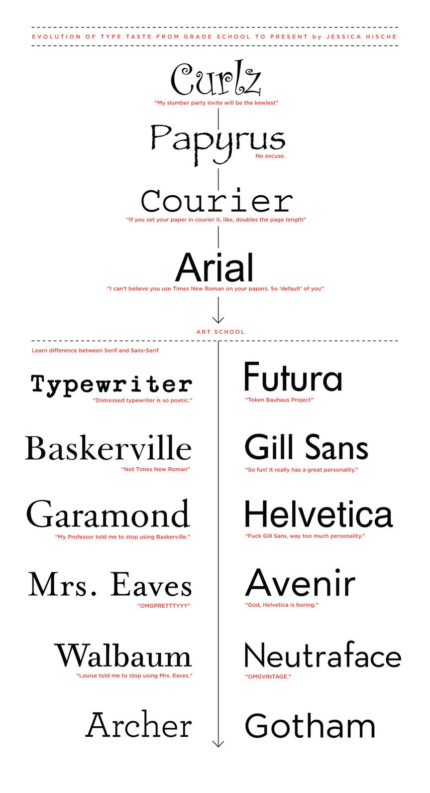
Graphic artist and typeface fancier Jessica Hische – who recently wrote the brilliant “The work you do while you procrastinate is the work you should be doing for the rest of your life” – posted this great graphic showing the evolution of her type taste from grade school to the present day. Click it to see it at full size. Oh, I remember my Helvetica Condensed Black Oblique phase…
Major General (Retired) Charles Calvin Rogers was the highest-ranking African-American to receive the Medal of…
Another Sunday, another “picdump!” Here are 200+ memes, pictures, and cartoons floating around the internet…
A Swedish TV program labelled Vladimir Putin as “President USA.” My thoughts on this:
[ The original version of this article is incorrect, so I’m substituting its content with…
A reminder: kakistocracy means “a state or society governed by its least suitable or competent…
Le Figaro, a daily newspaper in France that’s been around since 1826, has published an…
View Comments