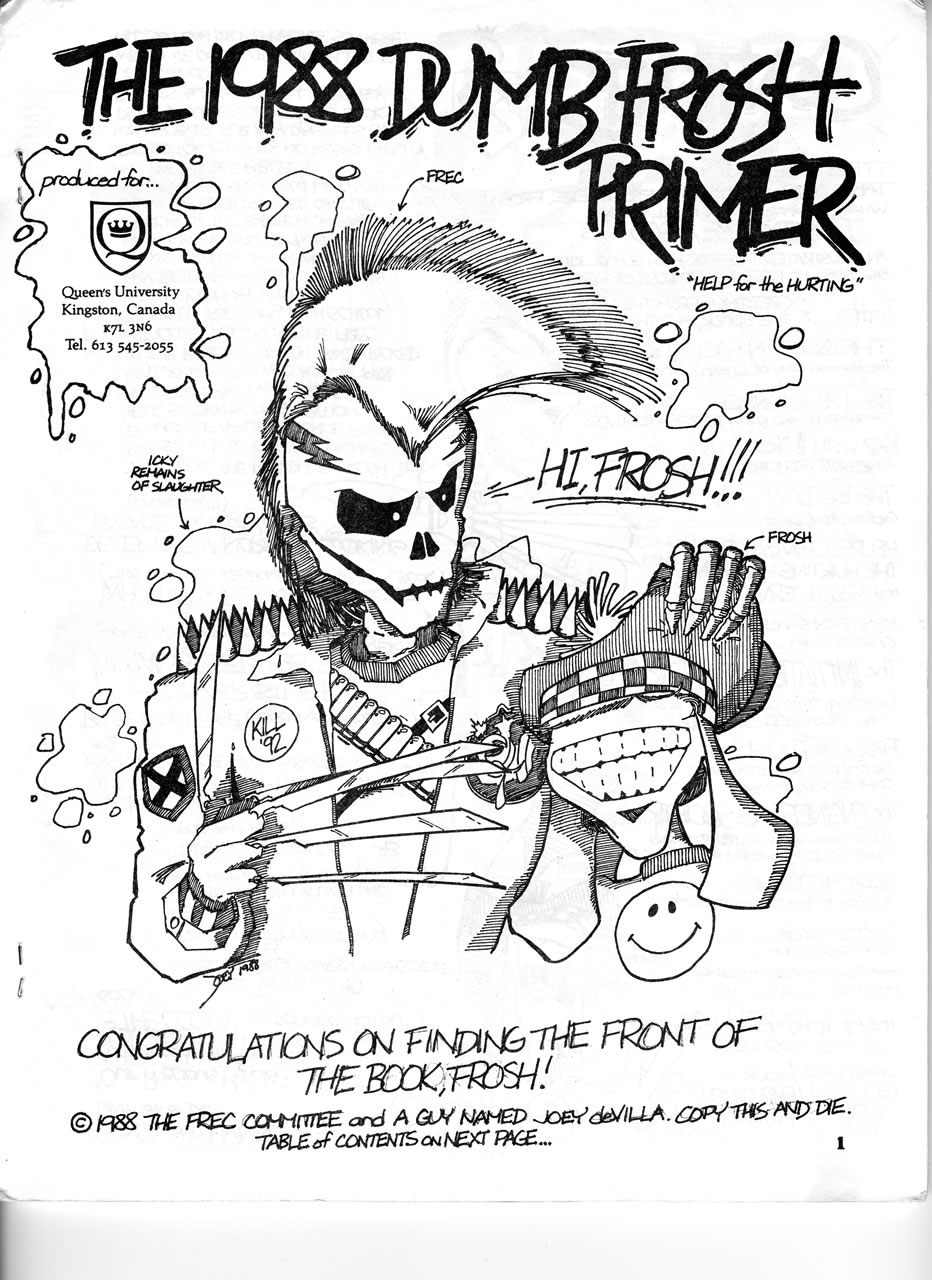
The inside cover of the 1988 Frosh Primer, which was mailed to incoming engineering students at Queen’s University during the summer of 1988.
Click the scan to see it at full size.
“Hey, Joey,” said Stéphane Germain, “how would you like to write the Frosh Primer?“
It was the spring of 1988, and I was an engineering student at Crazy Go Nuts University. The school year was winding down, but since we would return in the fall as second-year students, we’d be in charge of initiating the incoming first-year students, colloquially referred to as “the frosh”. Orientation Week, better known as “Frosh Week”, was a more civilized version of the opening scenes of Animal House, and a good chunk of is was run by the second-year students (and it’s wonderful, despite what professional wet blanket Russell Smith has to say about it).
Stéphane was Chief FREC, where FREC was short for Frosh Rules Enforcement Committee, the collection of second-year engineering students tasked with initiating the first-years. An incoming student’s first taste of Frosh Week was the Frosh Primer, which served as both a guide to the university and the orientation process, and advance mocking (“You’re so dumb, frosh!”).
“I’d love to, Steph,” I replied. While the previous year’s was amusing, I thought I could do a much better job. “What kind of editorial leeway do I have?”
“Lots. Just use your own common sense,” he said, with a look that suggested that he was beginning to see an oncoming disaster.
“Hey,” I said, “I just want to go for amusing, and maybe tone down some of the stuff so that the incoming girls don’t regret going into engineering.” We had a record number of women in our class, and it seemed as though there’d be even more in the following year. “And I want to drop the use of the word ‘homo’ as an insult.”
“Sure,” he said, looking relieved. He may have commissioned the Primer to the closest thing our year had to a “Bluto” from Animal House, or “Van Wilder” from the film of the same name, but even at that age, I knew the Golden Rule of Funny: if it bends, it’s comedy, if it breaks, it isn’t.
“What’s my page limit?” I asked.
“Don’t go above 50,” he said. The previous Frosh Primer was 28 pages, but he knew I loved to write.
“I want to put in cartoons, and bring in a writing staff,” I stated. Back then, I was known not as an accordion player, but as a cartoonist.
“Sure. Do you need beer for the staff?”
I didn’t expect the offer. “Four cases,” I said.
“Okay,” he said, without even batting an eye. He handed me enough money for 96 bottles of beer.
“Just make it good, use your better judgement, and remember: the frosh must be mocked,” he said.
“Frosh are dumb,” I said, reprising the mantra.
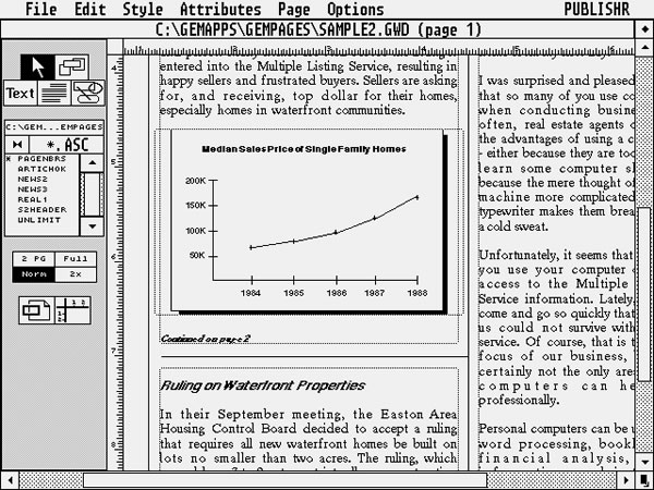
I spent the spring and early part of the summer working on the Frosh Primer, making use of a couple of then-new tools and technologies. The first was a desktop publishing application made by Xerox called Ventura Publisher. It didn’t run on Windows, but a GUI called GEM (most PCs were still running command-line DOS back then). It looked like this:

The other was a relatively new piece of equipment: a laser printer. It was the size of a small photocopier, could print a letter-size page every two minutes, and sounded like a jet taking off every time it cranked out a page.
Time and resources on the laser printer were precious, so they asked me if I could keep it down to 36 pages of laser-printed material. Since I was making a 48-page booklet, the remaining 12 pages would have to be done using something else. Since I was a cartoonist and had full editorial control, I simply decided to fill those remaining 12 will comics and illustrations.
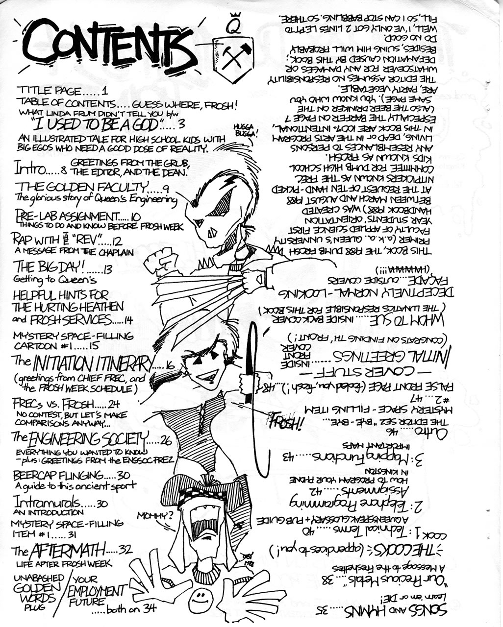
The table of contents was the last thing to get done, and by then, I’d used up my allotment of laser prints. So, I just cartooned it instead:

The table of contents for the 1988 Frosh Primer.
Click the scan to see it at full size.
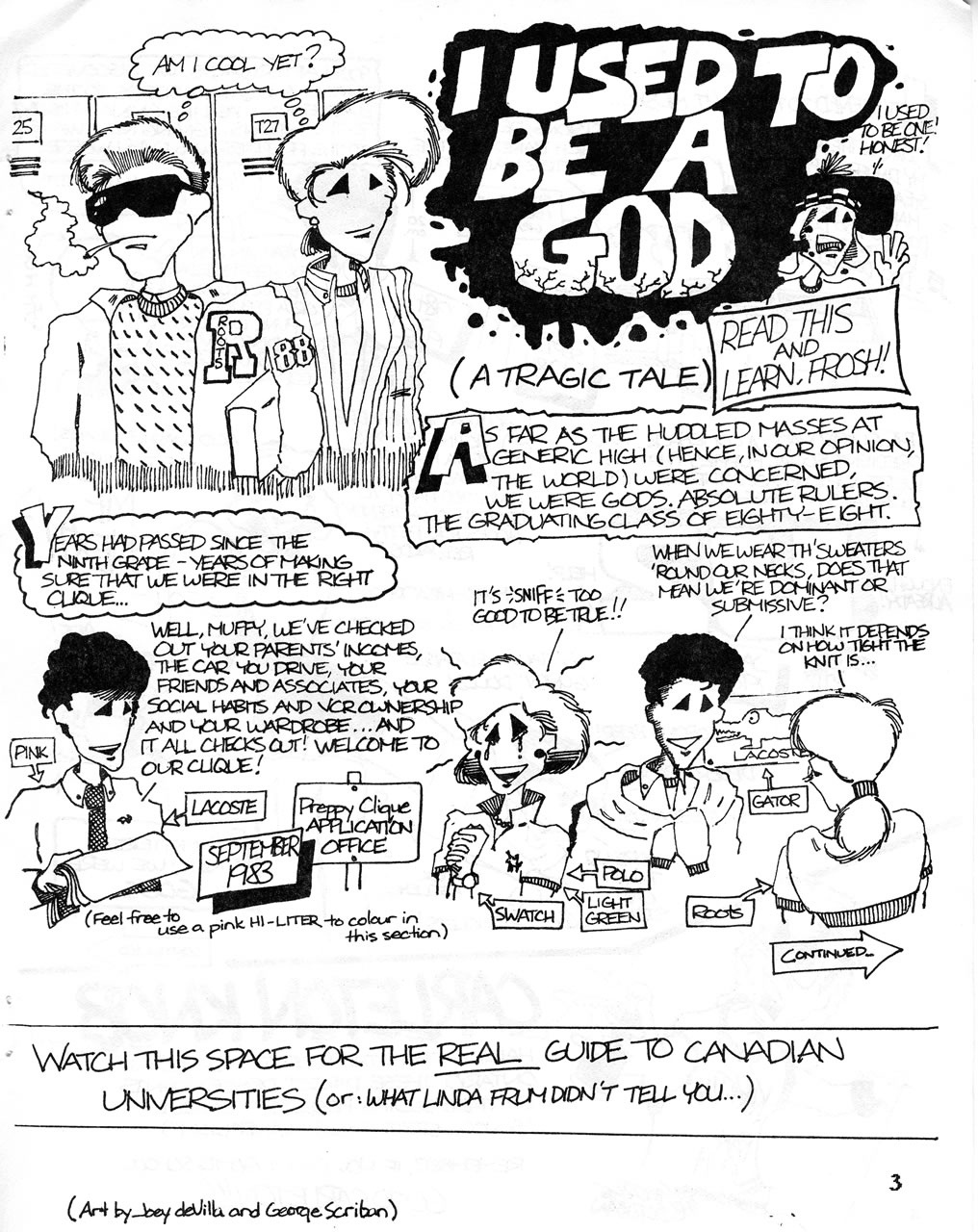
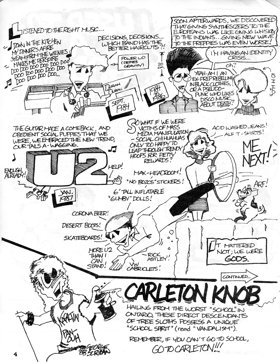
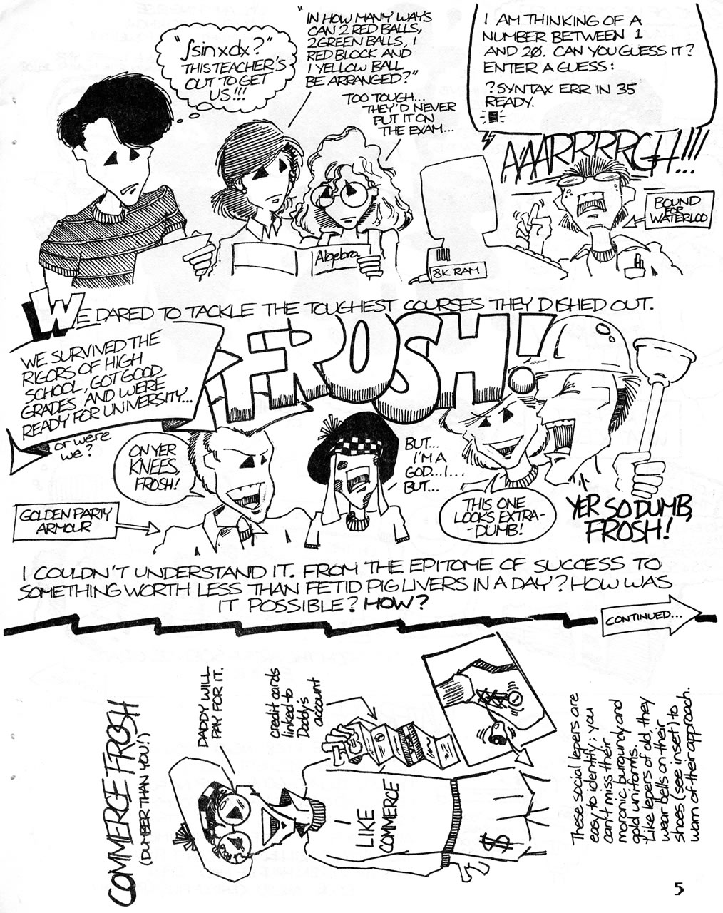
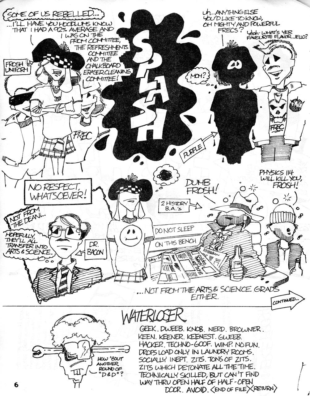
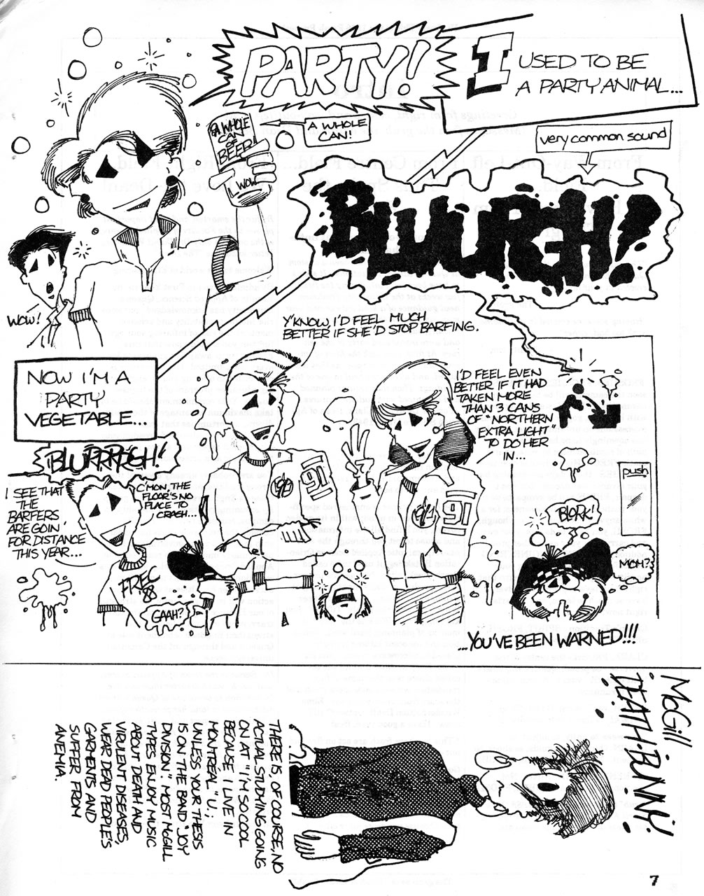
I decided to start the primer with comics rather than text, as I thought it’d be more fun, and allow for some really silly storytelling and frosh-mockery. I wrote, pencilled, inked and lettered the comic, titled I Used to be a God, whose purpose was to point out to the frosh that while they may have been hot stuff in their final year of high school, they were mere frosh now. And they were dumb. The comic was accented with sidebars written and illustrated by my good buddy George Scriban.
As for the triangle-shaped eyes on the characters, that was an affectation of mine. It came from trying to borrow Phil Foglio’s style from his comics in Dragon magazine in the early 1980s, and eventually morphed into their own thing.
While doing some cleaning up for my move out of my High Park apartment to the wilds of Etobicoke (“Rob Ford Country!”), I found my copy of the Frosh Primer and decided to scan and share some of it. Some of the references firmly rooted in 1988, but I think the comic still holds up. Of course, I’d say that. Anyhow, read and enjoy!

Click the scan to see it at full size.

Click the scan to see it at full size.

Click the scan to see it at full size.

Click the scan to see it at full size.

Click the scan to see it at full size.
