Month: October 2015
Photo by Yours Truly.
It’s the season formerly known as “Fall” or “Autumn”, but it’s now called “Pumpkin Spice Season”, when everything gets blasted with pumpkin spice (or pumpkin pie spice), a vague designation that usually means some combination of cinnamon, nutmeg, cloves, allspice, and sugar, with the less basic-bro/bitchy types throwing in a little ginger to give it some zing.

Photo by Yours Truly.
With the release of the Pumpkin Spiced Pumpkin Seeds pictured at the top of this article, we’re getting pretty close to the event horizon. We’ll truly hit it only when someone finally comes up with pumpkin-spiced pumpkin spice. As for the seeds pictured above, I hate to admit it, but they’re so very dangerously addictively delicious.
Found via @ MargaretNrthwd. Click to see the source.
As much as I love to mock, I’m not ready to go as far as the Washington Post does in their recent article, titled Enough with the Pumpkin Spice, America. It’s Getting Embarrassing. It’s America’s very own thing, it’s still the early days in the culture, and hey — you don’t see anyone in India going “Cool it with the curry, guys, we’re turning into a stereotype”, or in my own native neck of the woods saying “Cut it out with the rice already!”
Friday fashion advice

A fedora, while jaunty when worn right, comes with so much negative cultural baggage at this point in time that you’re best off leaving it alone, along with flare pants and wide lapels.
If you need a little more background on what happened to this poor hat, Vice’s History of the Fedora should help you get up to speed. An excerpt:
While the fedora was enjoying its brief re-entry into the realm of the fashionable, a writer named Neil Strauss was hard at work on what would become the foundational text for the fedora’s terminal phase. In his book The Game: Penetrating the Secret Society of Pickup Artists, Strauss described the “seduction community,” a loose group formed online and IRL by nerdy, socially awkward–and often white, middle class, and entitled–heterosexual men who gave money to self-styled “pickup artists,” or “PUAs,” in hopes of learning how to manipulate women into sleeping with them. Among more nefarious tactics like “negging” and “cat-string theory” was “peacocking“: “a technique developed to get attention in busy, distraction-filled environments such as night clubs…by wearing something showy like a cowboy hat or a glowing necklace.” Many men took this as a cue to wear a hat. Many of these hats were fedoras. In a paper titled “Fedora Shaming as Discursive Activism,” Ben Abraham pinpoints a widely reblogged tip from a popular PUA forum:
“If you wear a hat, make it memorable, easy to spot, and something to work with your style. This is usually easier than it sounds. Try the fedora…it portrays you’re a stylish man that knows what he’s doing, and it’s a great lock-in prop.”
This was both a reflection of pre-existing fedoras and a catalyst for fedoras to come. An infinite feedback loop; a douchebag ouroboros.
Click the graph to see the source of this misleading graph, the Fraser Institute report Ontario: No Longer a Place to Prosper.
In their latest white paper, the conservative/libertarian/pro-Voldemort think tank known as the Fraser Institute is playing dirty statistics pool. Take a look at the graph above (taken from page 15 of the report), which at a casual, innumerate glance, paints a picture of Ontario as a Soviet-style bureaucracy where there are more public sector jobs than private sector ones.
Then take a closer look at the Y-axes for each of the job categories:
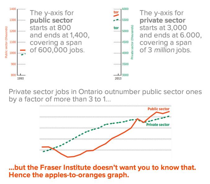
Each line has its own y-axis, with the private sector axis starting at a higher number and on a much larger scale than the private sector axis. This trick allows them to make it appear as if public sector jobs are taking over, a bit of graphing jiggery-pokery that’s about as intellectually honest as the canoe vs. battleship comparison shown below:

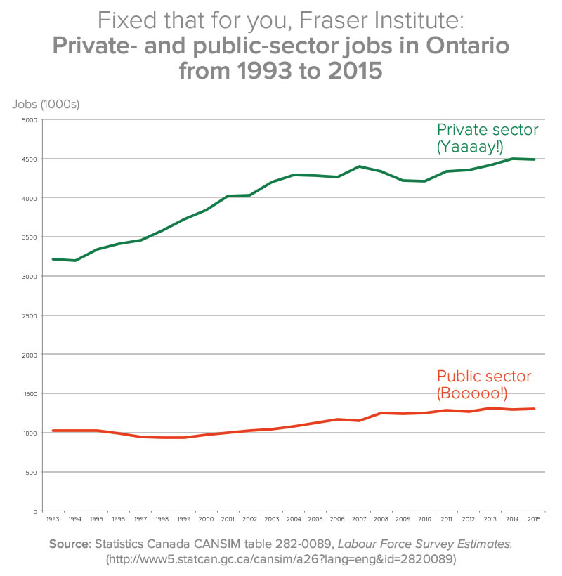
The one bit of honesty in the Fraser Institute’s graph is that they provided a citation showing where they got the data from: Statistics Canada’s CANSIM table 282-0089, the Labour Force Survey estimates. I went there, used the “add/remove data” feature to narrow the report down to Ontario for the years 1993 through 2015, plugged the January numbers for each of those years into Excel and generated this graph:
Click the graph to see it at full size.
The funny number games don’t appear to end there, however:
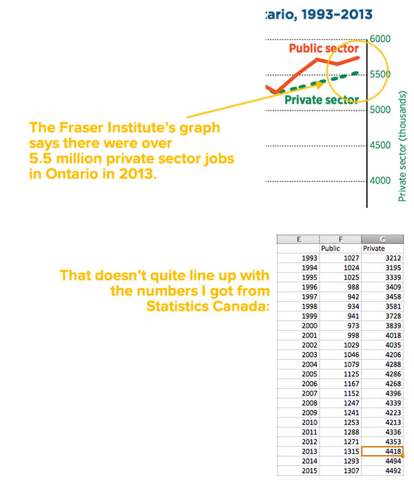
Again, if you want to look at the numbers, go to Statistics Canada’s CANSIM table 282-0089, the Labour Force Survey estimates, use the “Add/remove data” feature to limit the numbers to Ontario, and set the span of time to January 1993 – January 2015. I took those numbers and plugged them into this spreadsheet.
When someone presents you with a graph like the Fraser Institute’s, they’re counting on you to be lazy and ignorant. Don’t let them be right.


