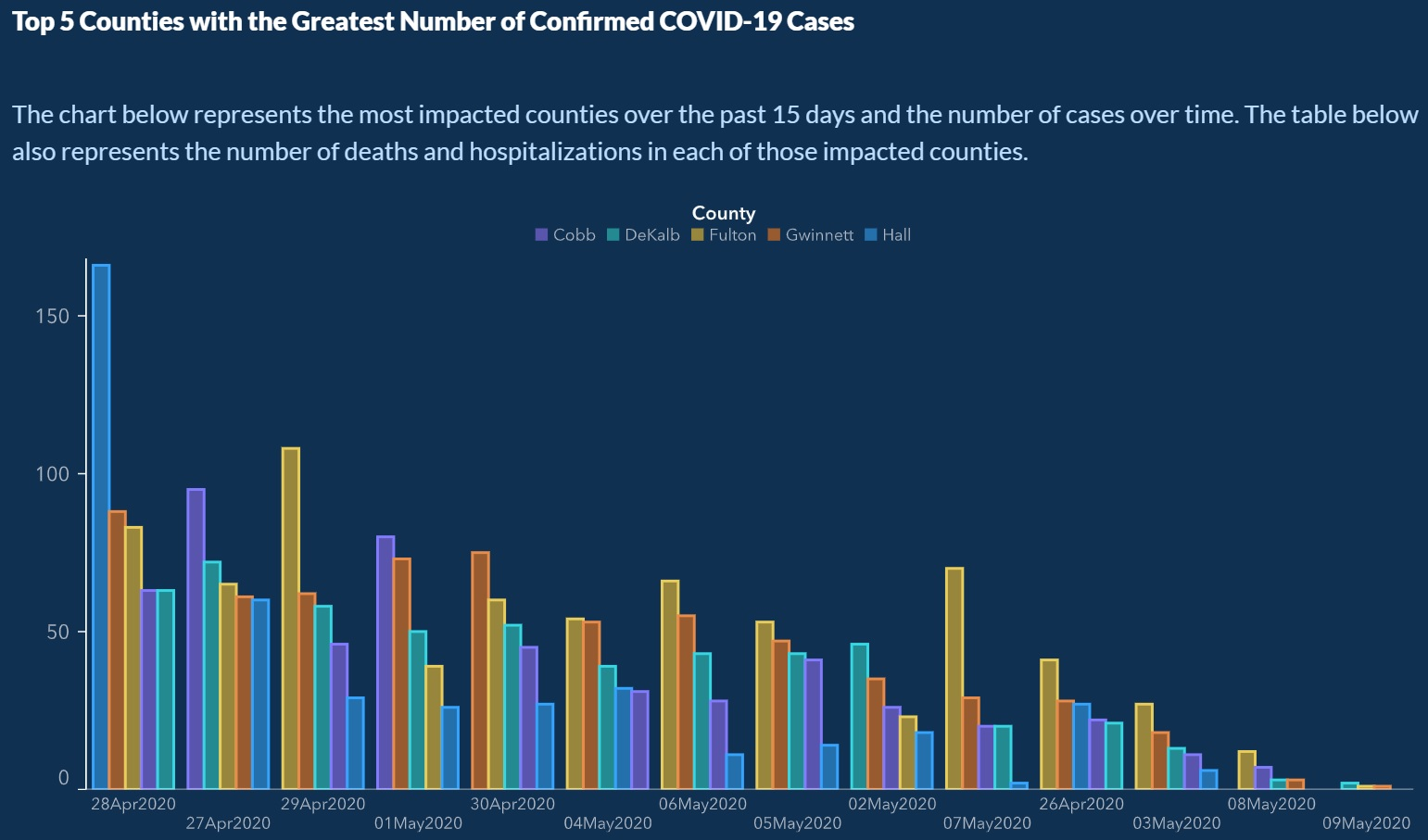
The graph released by the Georgia Department of Public Health.
Tap the graph to see it at full size.
Pictured above is a graph released a few days ago by the Georgia Department of Public Health, showing the top 5 counties in the state with the most confirmed cases of COVID-19.
You’d think that things were getting better, as it appears to show a downward trend — until you look more closely at the dates on the x-axis (the one on the bottom, going from left to right):
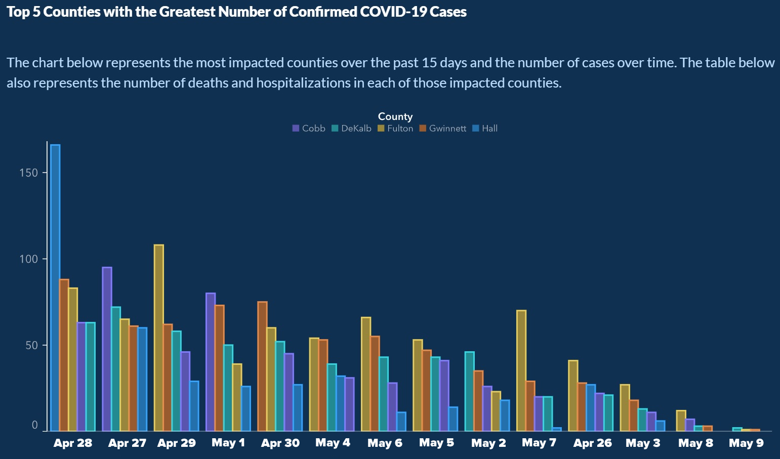
The same graph, but with the dates emphasized, revealing their incorrect order.
Tap the graph to see it at full size.
The dates are out of order. In fact, they’ve been specifically re-ordered to make it look as if the number of cases has been dropping steadily for the past few weeks.
Don’t see the trick? Look more closely (tap on the graph above to see it at full size), and you’ll see that the dates are listed in this order:
Whoever made the graph seems to have been counting on the math-phobia that many people have, people’s limited attention span, and possibly even general COVID-19 news fatigue. They took care to make sure that the first date on the x-axis was in April and the final date was in May, but assumed that most people wouldn’t look too closely at the dates in between. I’m almost in awe of the gall it takes to commit this act of deception so brazenly.
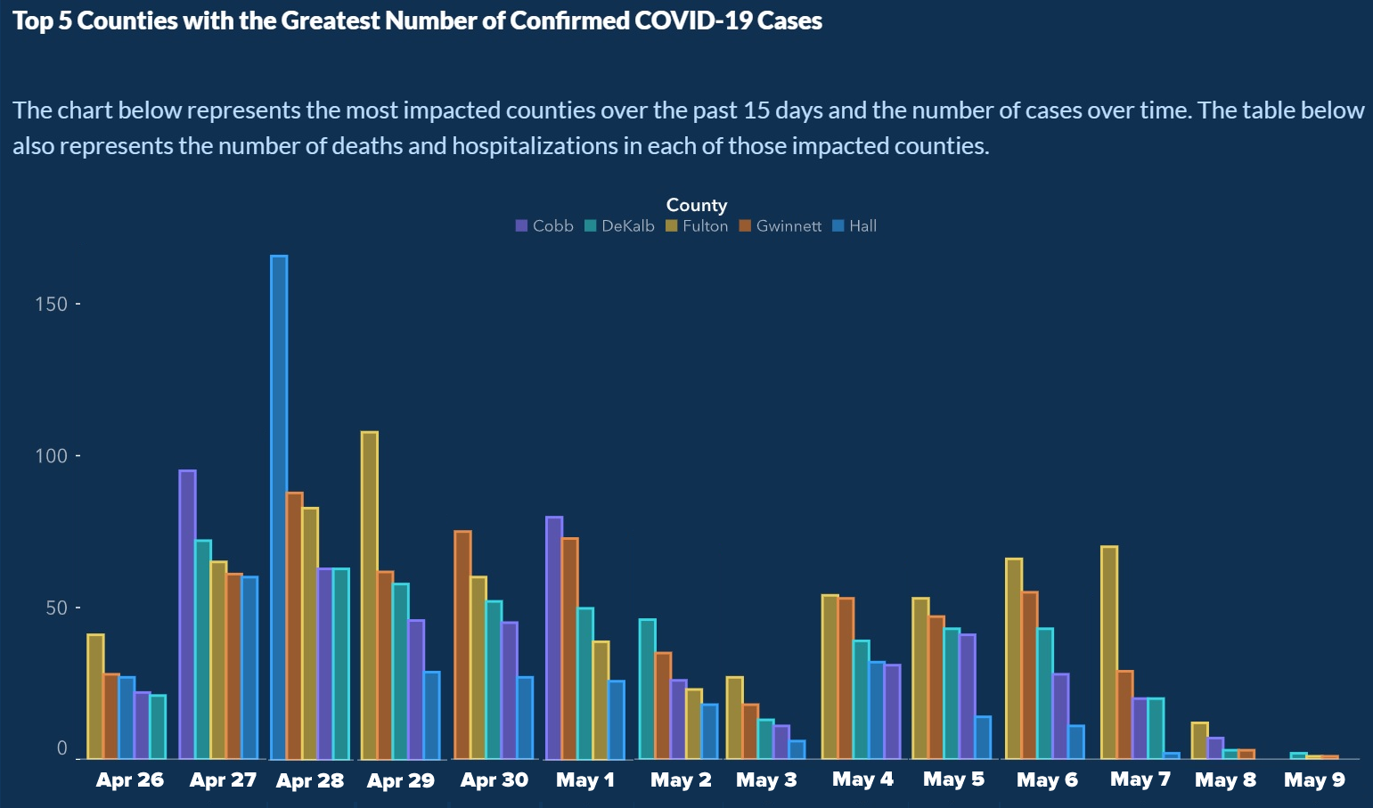
As a public service, I’ve re-ordered the graph so that the case counts are listed in proper chronological order:
The graph, rearranged by me so that the x-axis is no longer deceptive.
Tap the graph to see it at full size.
There’s one more deceptive thing about the graph that you should notice, and which I don’t have time to correct: For every date, the county order is different (look at the colors of the bars). In fact, the order is always from highest to lowest number of cases, a design trick meant to fool the eye into seeing a consistent downward slope:
A number of eagle-eyed people on the internet caught this, and Georgia officials started back-pedaling quickly. Here’s a tweet from Candice Broce, Communications Director and Chief Deputy Executive Counsel for Georgia Governor Brian Kemp (who had to learn that you can be a carrier of a disease without showing any symptoms, and who’s been overearly eager to re-open the state):
The Atlanta Journal-Constitution has a story on this: ‘It’s just cuckoo’: state’s latest data mishap causes critics to cry foul.
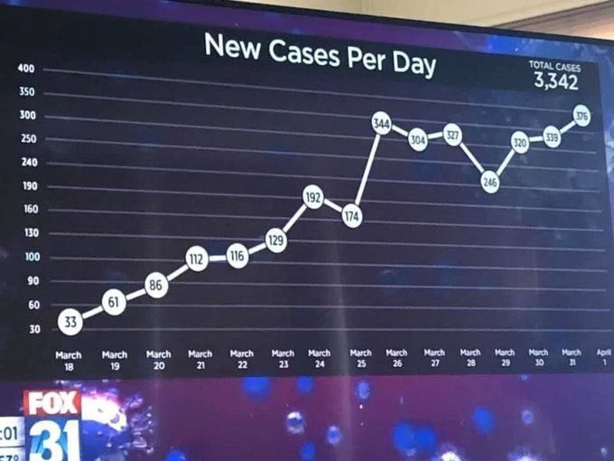
You should keep an eye out for deceptive graphs, as they’re getting used more often. Here’s one from last month:
Tap the graph to see a slightly larger version.
Take a closer look at the graph’s y-axis:
Remember this aphorism: “Numbers don’t lie, but liars use numbers.”
It’s Sunday, which means it’s time for another “picdump!” Here are 113 memes, pictures, and…
It’s the first Sunday of 2025, so it’s time for the first “picdump” of 2025!…
For the past eight years, my sister, Eileen de Villa has been Toronto’s Medical Officer…
It’s New year’s Eve, and in celebration, here’s a mini-picdump of NYE-themed memes! If you…
Since it’s Sunday, it’s time for me to post the memes, pictures, and cartoons floating…
How did I not know about the Joe Pesci Home Alone yule log stream until now?…
View Comments
Back in the day, as a back office man, I used to fudge sales charts and projections to make the sales team look good to management, but this is really eye-popping! My God....I was born 50 years too early! But just think what Westmoreland could have done in Vietnam with accounting like this. You'd have left Vietnam with more troops than you'd sent and all been home in time for Christmas, twice a year!
May be that's why folks say: "Lies, lies, and Statistics" :(
However, I think the above skepticism usually refers to MISINTERPRETATION of statistical analysis, rather than MIS-REPRESENTING the data.
The above graphs were probably produced by re-ordering the rows in a spreadsheet so that the #cases show the desired trend. Then the bar-chart (or "Curve") is drawn.
This is following our "Leader" who declared that he "Does not LIKE the numbers" and proceed to modify the data to get what his "GUT" like better.
This is just another example of "Fake Data" so common these days. Photos, videos, web postings, emails, demonstrations .... are no longer trustworthy.
Still, one small lesson to be learned here:
Examine the axes markings of the graph / curve carefully. The markings have to be in sequence and separated equally. The content of the presentation is meaningless without good axes and markings.
I used the same graphing technique to make a chart for our country - https://twitter.com/DavidAronCohen/status/1262768640836931584/
Why do we just laugh at this? Why does the person responsible for this still have a job?