Don’t get the reference? See the Wikipedia entry for “Home Taping is Killing Music”.

Don’t get the reference? See the Wikipedia entry for “Home Taping is Killing Music”.
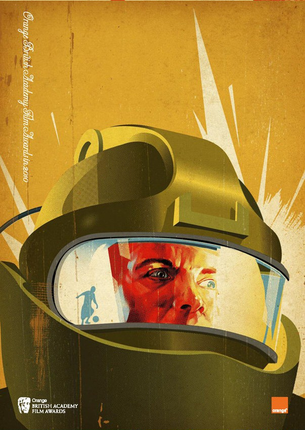
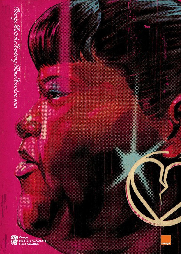
Graphic designer Tavis Coburn designed the program covers for this year’s BAFTA (British Academy of Film and Television Arts) Awards, and they’re retro-cool! Each one features elements from the nominees for the Best Picture Award.
Here’s the cover featuring Up in the Air, with a very Mad Men-esque treatment of George Clooney:

This is the cover for An Education:

It took me a moment to figure this one out. The helmet screams “space movie”, but the reflection of the child playing soccer in the visor makes it clear that the movie depicted here is The Hurt Locker:

Avatar, obviously. I still haven’t seen this movie. Mind you, I didn’t see Titanic until 2005. I like to think that anything I was doing around the turn of the millennium was far more interesting than any movie, especially a schmaltzy James Cameron date flick.

And finally, Precious:

Yes, that Dolph Lundgren – the guy who played “Ivan Drago” in Rocky IV and the cyborg preacher in Johnny Mnemonic. Here he is, bringing the house down with the long-underappreciated Elvis single as part of his co-hosting duties for Melodifestivalen, the event where the Swedish entry for the Eurovision Song Contest is chosen. He doesn’t just sing, he also dances, plays the drums, does some martial arts and rocks the black tie look:

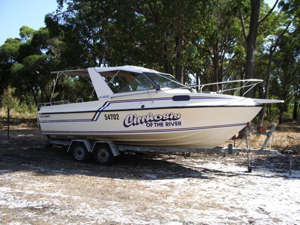
You say “worst boat name ever”, I say “greatest party boat evarrr!”
 Photo courtesy of Certified Bullshit Technician.

You young’uns may have learned about typefaces and the difference between serif and sans serif from using the “font” settings on your computers, but I learned from using Letraset (and often, its budget-priced brother, Geotype). They were sheets of rub-down transfer lettering and clip art. The principle behind Letraset wasn’t all that different from temporary tattoos. The stuff went the way of the dodo once desktop publishing and laser, inkjet and dye sublimation printers caught on.
Graphic artist and typeface fancier Jessica Hische – who recently wrote the brilliant “The work you do while you procrastinate is the work you should be doing for the rest of your life” – posted this great graphic showing the evolution of her type taste from grade school to the present day. Click it to see it at full size. Oh, I remember my Helvetica Condensed Black Oblique phase…