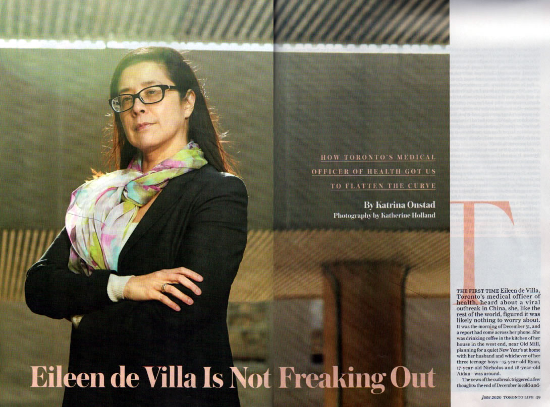
Tap the photo to see it at full size.
Toronto Life’s June 2020 issue features a story on my sister titled Eileen de Villa Is Not Freaking Out. Regular readers of this blog will know that my sister Eileen is Toronto’s Medical Officer for Health, which means she oversees the public health agency for Canada’s largest city and economic capital.
FYI: For this of you who aren’t from Toronto, Toronto Life is a “city news and culture” magazine of the sort that all large cities have. Think of it as the Toronto analog of New York Magazine.
My brother-in-law Richard send me a scan of the article in this morning’s wee hours, and Toronto Life hasn’t published it online yet. I think it does a great job of explaining who she is and what she does. Author Katrina Onstad interviewed not just Eileen but a number of her friends and family, including me — in fact, as you’ll see later in this post, I may have contributed to the article’s title.
I’ll link to the Toronto Life article when it goes online, but in the meantime, here are a couple of snippets that I’ve transcribed for your reading pleasure.
During lockdown, I’ve found myself oddly compelled by de Villa’s daily press conferences. Perhaps it’s the scarf that rotated reliably every day. Perhaps it’s the unflinching scientific explanation of calamitous news, the soothing way she delivers her sensible pleas to physically distance and shelter at home, like a patient teacher leaving a pause for each student to mentally translate… before… moving… on. That nerdy, radiant patience is not just a counterintuitive response to the chaos, but something inborn.
…
De Villa took the top position at Toronto Public Health three years ago. It’s a gig that’s equal parts extremely important and extremely unglamorous. Her job is to persuade us that our lives are worth saving. Before COVID-19, she was in non-stop PSA mode, imparting the dangers of smoking, the need for vaccinations, the scourge of opioid-related deaths. Her drumbeat was steady: health status has little to do with health care and more to do with social determinants like education, housing, poverty. Councillor Joe Cressy, chair of the city’s board of health, describes her as a rock. “But a human rock,” he clarifies. “Calm, steady, deeply compassionate. That said, science is what drives her policy recommendations.” But years of proselytizing isn’t what got her name on a T-shirt. Her 2018 TEDx talk on opioids (titled, now ironically, “The Defining Health Crisis of Our Time”) has only 4,300 views on YouTube.
…
Her low profile ended when the pandemic hit. She’s appeared on our screens almost daily, seated behind a blue-skirted table next to [Toronto Mayor John] Tory, in front of a row of flags, delivering alarming numbers about how many Torontonians are sick and dying. After reciting the numbers, she gently — very gently — asks us to do better, to be personally vigilant for the greater good. Clarity is her brand. Fine. We’ll take it. The calm is comforting; we hope that it’s infectious. The calm is why it’s charming and incongruous to see her doing live FaceTime chats with [Toronto Raptors player] Serge Ibaka, or starring in a mystery Twitter account called “Dr. de Villa’s Scarf” that tracks her daily scarf habit (@de_scarf).
Big point of information: Eileen was doing the scarf thing well before Dr. Deborah Birx.
My favorite part of the article is the one from which it gets its title:
…To someone whose feet tend to stop in a crisis, who seethes at injustice when put on hold for more than 10 minutes, de Villa’s constant unflappability is both admirable and perplexing. Refusing high drama is a family trait, according to de Villa’s brother. “There’s no freaking out,” Joey says. “I get annoyed when people lose their minds in a tough situation without trying to collect themselves first. She feels the same way. Any time she’s faced with a problem, she first takes everything in and goes, ‘What do we know about this? Let’s get another perspective on the situation.’”
He is describing the professional approach of both a good doctor and a good bureaucrat — which is, in effect, the job of the medical officer of health.
Nicely done, sis!


