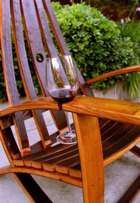
I like this idea: a notch cut into the armrest of this wooden chair to hold your wine glass.

I like this idea: a notch cut into the armrest of this wooden chair to hold your wine glass.
That most hated of typefaces, Comic Sans, gets anthropomorphized and bad-assified in Mike Lacher’s piece for McSweeney’s titled, (in)appropriately enough, I’m Comic Sans, Asshole.
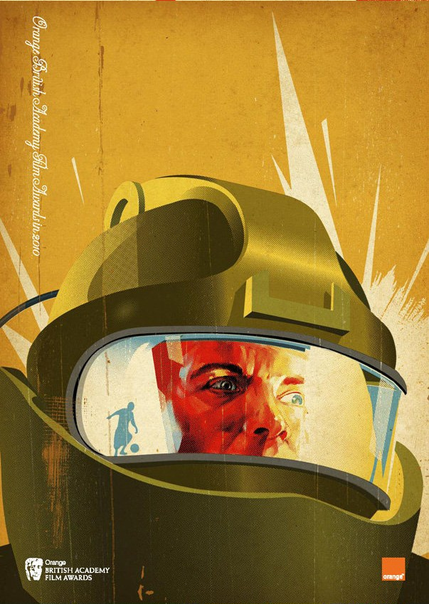
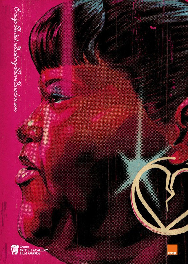
Graphic designer Tavis Coburn designed the program covers for this year’s BAFTA (British Academy of Film and Television Arts) Awards, and they’re retro-cool! Each one features elements from the nominees for the Best Picture Award.
Here’s the cover featuring Up in the Air, with a very Mad Men-esque treatment of George Clooney:

This is the cover for An Education:

It took me a moment to figure this one out. The helmet screams “space movie”, but the reflection of the child playing soccer in the visor makes it clear that the movie depicted here is The Hurt Locker:

Avatar, obviously. I still haven’t seen this movie. Mind you, I didn’t see Titanic until 2005. I like to think that anything I was doing around the turn of the millennium was far more interesting than any movie, especially a schmaltzy James Cameron date flick.

And finally, Precious:

Post Typography have a clever way of making their business cards – and more importantly, the contact info on them – memorable: